Redesign of a point-of-sale device interface for FELFEL
As part of a more recent freelance engagement, I redesigned the FELFEL smart fridge interface to meet the needs of the future. With the company’s growing number of appliances, moving to an app-based badging-in mechanism as well as its recent expansion to the US, a few pressing UX improvements were needed. Below you can find an overview of some of the new screens.
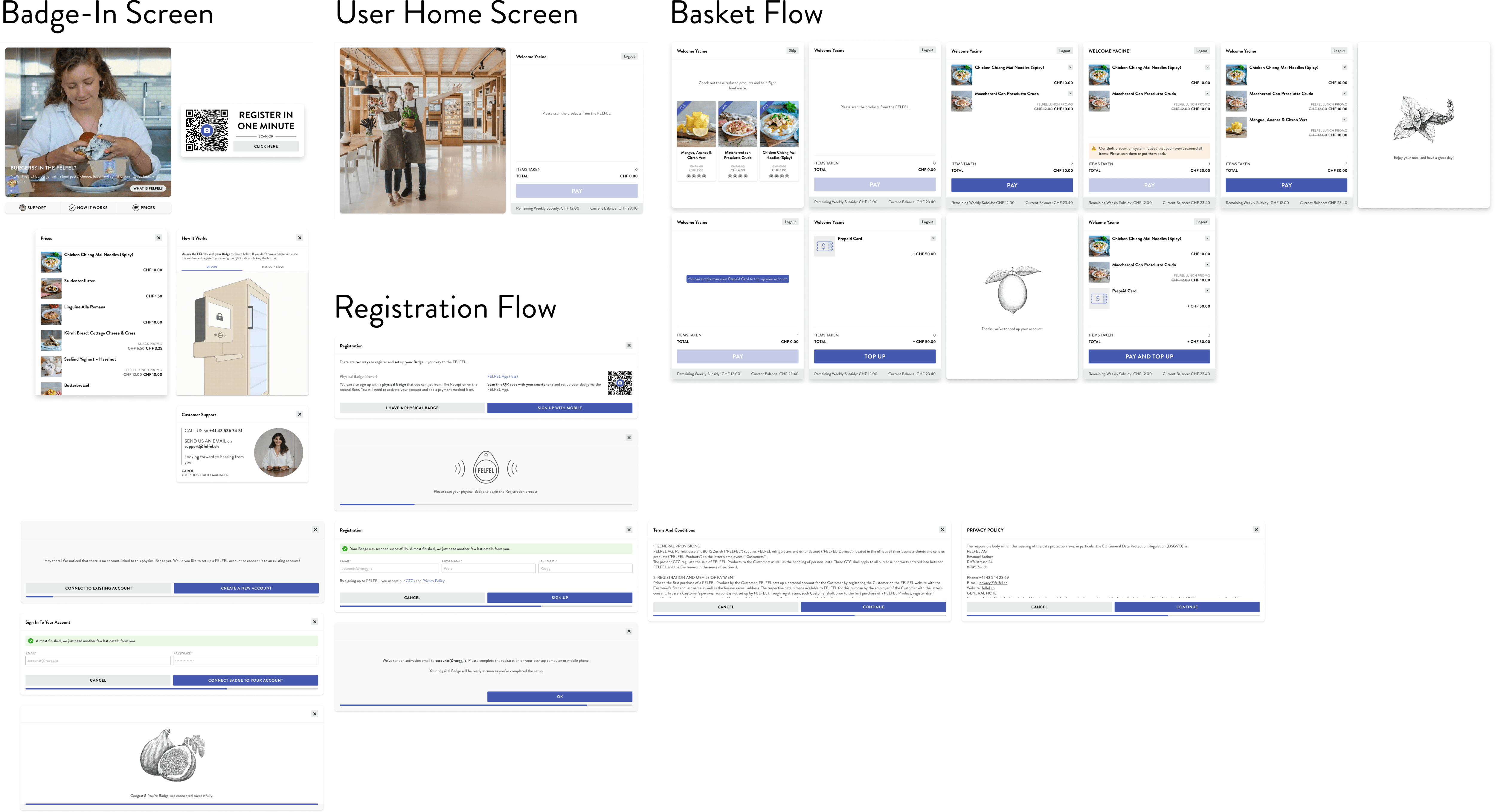
The big three requirements were making registration easier and more prominent, improving user engagement through better content delivery, as well as adding support for the theft prevention system.
Registration is now the primary action for new users and prominently placed on the screen. With a QR code containing a universal link, the user is immediately redirected to the correct App Store to download the FELFEL App and and is instantly paired with the right fridge. In this way, registration can be completed within a minute. We finetuned all the associated flows and made legacy modes of registering configurable per client, so that these are not anymore available for new customers. We also fixed various UX traps that related to the legacy mode of signing up with a physical badge, where previously you had to walk between the FELFEL and your computer twice to set up your Badge. This is now all possible in one easy flow.
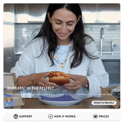
As the FELFEL is usually placed prominently within office kitchens, hospitals or schools, it is a great touchpoint to engage users more. For that reason, I suggested the use of videos on the POS that run as a configurable carousel showing content about the latest product lines, current discounts or marketing content (e.g. collaborations with new chefs). Additionally, a few videos are pinned, explaining the companies overall concept and how to use the smart fridge. This will be give a soft onboarding to any user that is completely new to the concept of a smart fridge, who can now watch an introduction video about FELFEL and its service proposition.
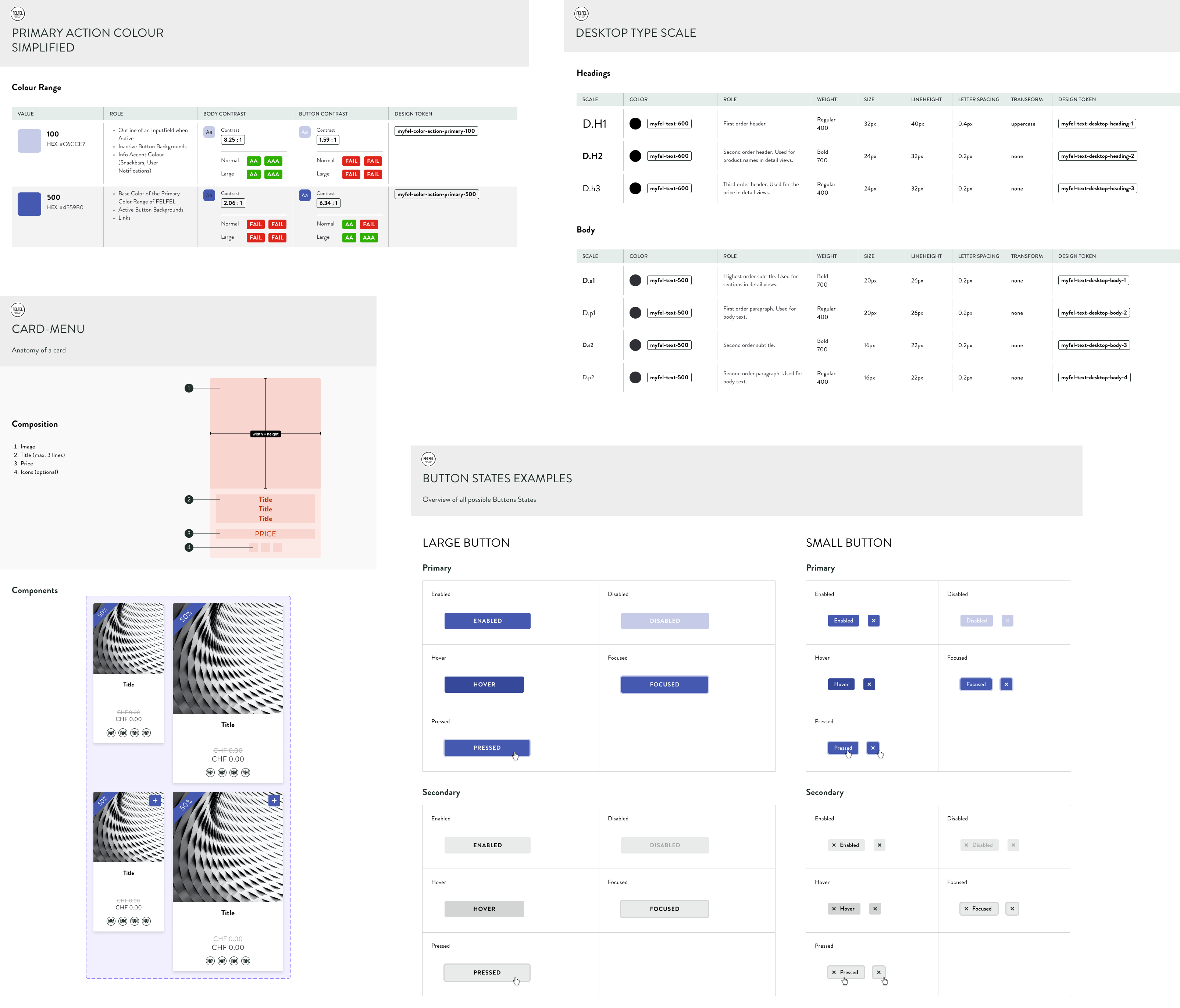
Technically, I could greatly profit from the Design System I had created previously via Figma in collaboration with Apps with Love. It defined brand colours, typography, common UI patterns such as dialogs, buttons or input fields. You can find a small extract of it below.